This website uses cookies. By clicking Accept, you consent to the use of cookies. Click Here to learn more about how we use cookies.
Turn on suggestions
Auto-suggest helps you quickly narrow down your search results by suggesting possible matches as you type.
5268members
1553posts
60online
- Invoca
- New Releases and Features
- Dashboards: Increased Data Points and Data Filteri...
Community Manager
Options
- Subscribe to RSS Feed
- Mark as New
- Mark as Read
- Bookmark
- Subscribe
- Printer Friendly Page
- Report Inappropriate Content
04-25-2024
03:06 PM
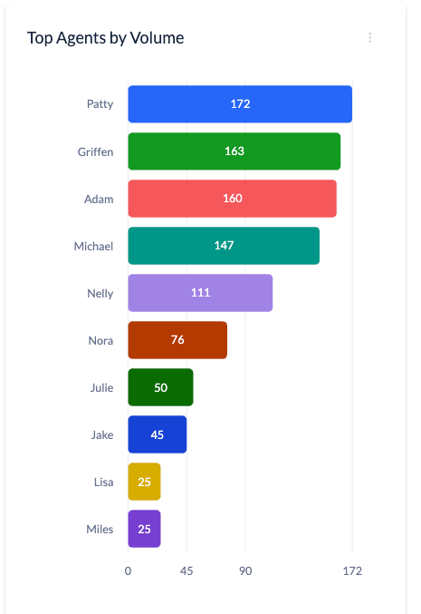
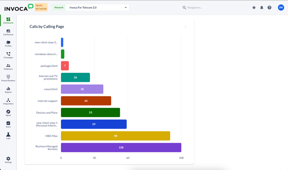
Now you can view up to 50(!) data points in each dashboard tile. In addition, you can now display data in ascending or descending order on a horizontal bar graph or table graph so that you can see top and bottom performing data points side-by-side.
New Use Cases
- The ability to see lowest performing campaigns, ads, and keywords at a glance enables better spend decisions
- See performance of up to 50 contact center agents at once, as well as highest and lowest performers at a glance
- Multi-location customers can now see highest vs lowest performing locations, call volume by location, etc.
Additional Details:
- Bar graph and table graph tiles can now display 5, 10, 25 or 50 data points and you can either display all data points by expanding the tile or click through a carousel of 5 data points each.
- You can update existing bar and table graph tiles with these new enhancements.
- Note on Exporting: It's important to note that dashboard exports will continue to reflect what you see on the screen, so data you need to paginate through to see will not appear on the export.
To learn all about setting up dashboards, including these new features, please visit the Knowledge Base.
You must be a registered user to add a comment. If you've already registered, sign in. Otherwise, register and sign in.


